The curtain color mistakes that could be ruining your entire decorating scheme – here's what to avoid and why
The errors designers see most often – and how you can swerve them
- (opens in new tab)
- (opens in new tab)
- (opens in new tab)
- Sign up to our newsletter Newsletter
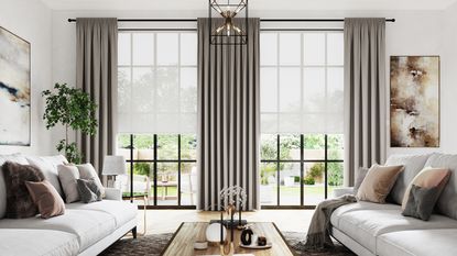

Curtains are an important part of the color palette selected for any room in a home. Choosing their color, therefore, isn’t simply a question of falling for a hue, but of considering it alongside all the other tones in the room. Important, too, are the light conditions, which can influence how the color appears.
The takeaway is that while a particular curtain color isn’t wrong in theory, it definitely could be a fail in the context of the space in which it’s hung and set alongside the shades selected for the walls or the furniture.
How to avoid making a color mistake when it comes to window treatment ideas? We asked interior designers to identify the issues particular colors create and to explain how to steer clear of errors in picking curtain hues.
How to avoid curtain color mistakes
Curtain ideas are crucial to the success of any interior. ‘It’s important to remember that curtains serve as the frames to our windows and often set the tone for the entire room,’ says Artem Kropovinsky, founder and principal at New York-based interior design studio Arsight (opens in new tab). ‘So, it’s crucial to choose the right hue to elevate the space.’
This is interior designers’ wisdom on what can go wrong when choosing curtain colors plus how to make sure you don’t follow in the footsteps of the unwary.
1. White
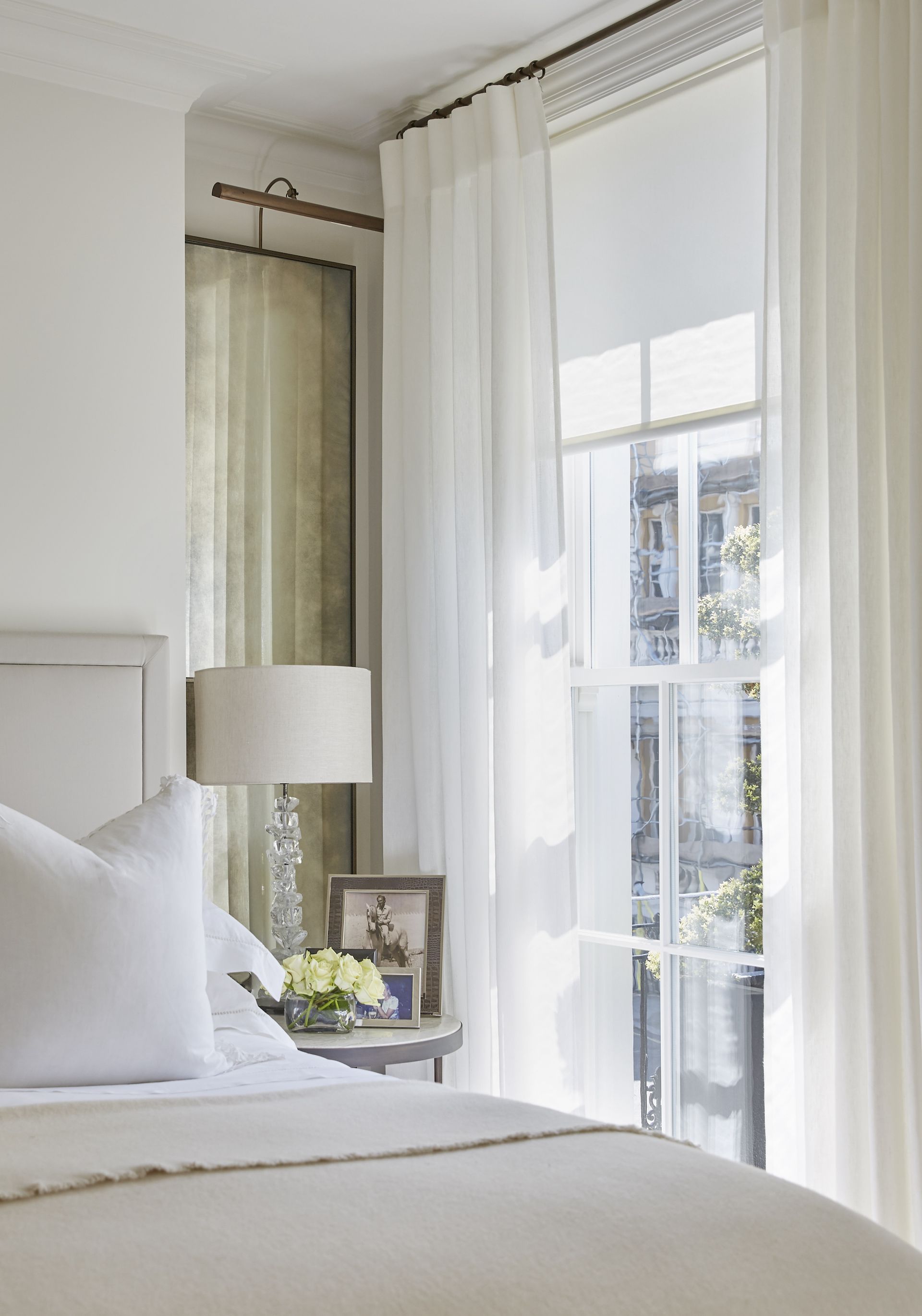
While you might think selecting white curtains is a way to play it safe and avoid color mistakes, there’s still room for error. Opting for them runs the risk of a finish that’s dull, warns Carlin van Noppen, CEO and head interior designer at Fig Linens and Home (opens in new tab). ‘When using white curtains, I would advise choosing a white with at least one subtle detail (like a band) in a color or neutral rather than going for an all-white look. If you do decide to go with an all-white look, be sure to alternate whites throughout the room. Varying shades and textures of white, ivory, and cream create more visual depth and keep the space vibrant.’
White curtain colors also run the risk of leaving the room overlooked. ‘These hues can create a clean and modern feel in any room, but they may not offer the privacy that is required,’ cautions Blima Ehrehtreu, founder and CEO of The Designers Group (opens in new tab), an interior design firm based in New York, Miami, and Toronto. ‘To balance both style and function, I explore options such as layering heavier fabric drapes or shades or opting for sheer or semi-sheer curtains that allow in natural light but still offer a modicum of coverage.’
2. Neutral
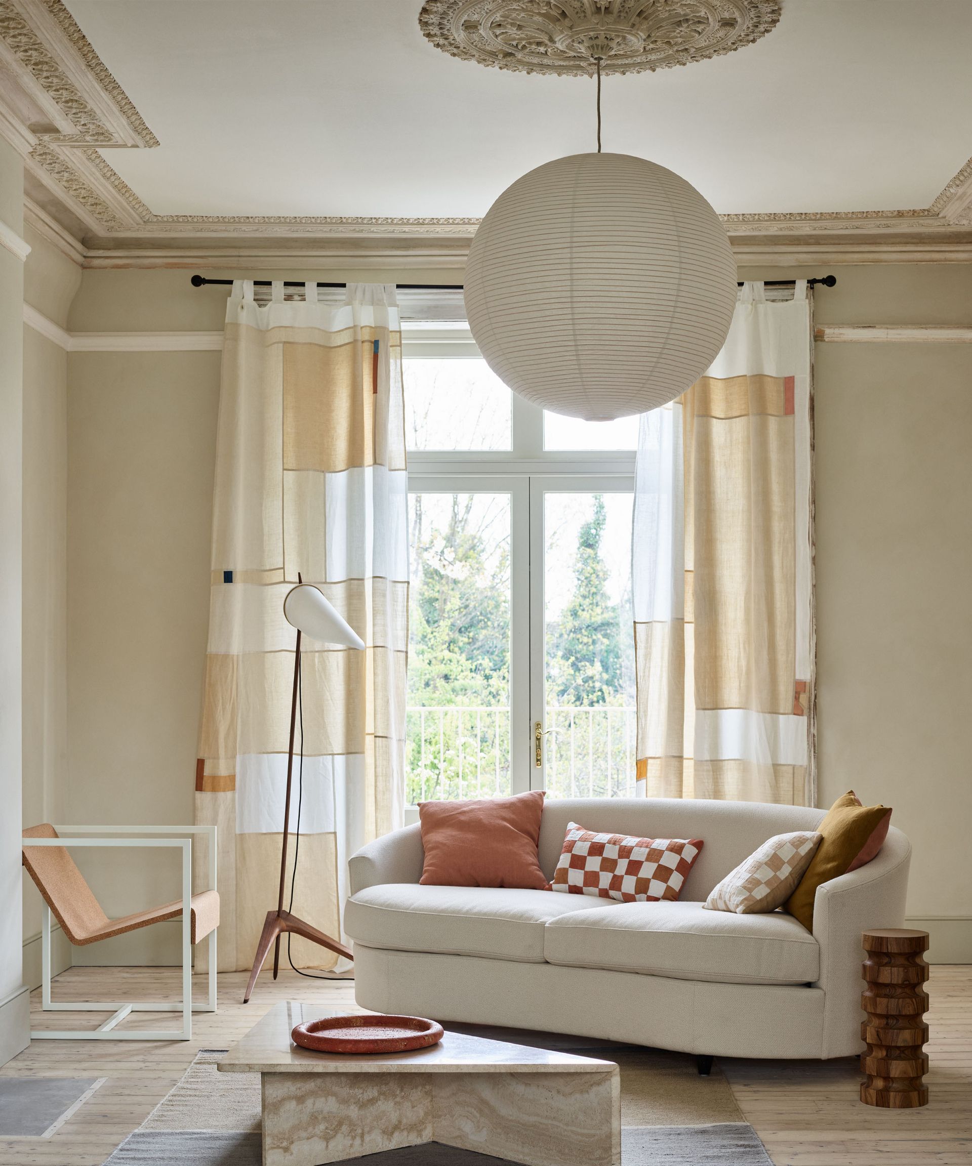
Like white, you might choose neutral curtains with the idea you can’t go wrong – but there are potential pitfalls. ‘One common misstep I see is opting for a neutral curtain color that blends in too much with the walls,’ says interior designer Artem Kropovinsky. ‘This results in a lack of contrast and can make the space feel flat and uninspired. Instead, consider adding a pop of color or pattern to the curtains to bring the room to life.’
Carlin van Noppen agrees that wall color is all important. ‘Neutral curtains that match too closely with the wall can give the room a drab and flat feel,’ she says, offering an alternative strategy if they’re your preference. ‘To keep neutrals interesting, be sure to choose curtains in either a coordinating neutral or a hue that is darker or lighter than the wall. I recommend ordering swatches to test how a neutral fabric changes throughout the day in different light.’
As with white, it’s important to think about the function of the drapery if you go with a light neutral. ‘In my opinion, this color is best used in a sheer or less opaque setup, where the fabric can act as a diffuser and even help brighten a room that may be too dark,’ says Dustin Gerken of Dustin Gerkin Design (opens in new tab) of Columbus, OH. ‘As a result, try a different color if you’re aiming for a more blackout fabric feel for bedrooms or rooms where you need less glare off a TV or similar screen. We love neutral sheers and fabrics, but they shock you with their ability to brighten a room if they receive too much direct light through the window.’
3. Brown and dark neutrals
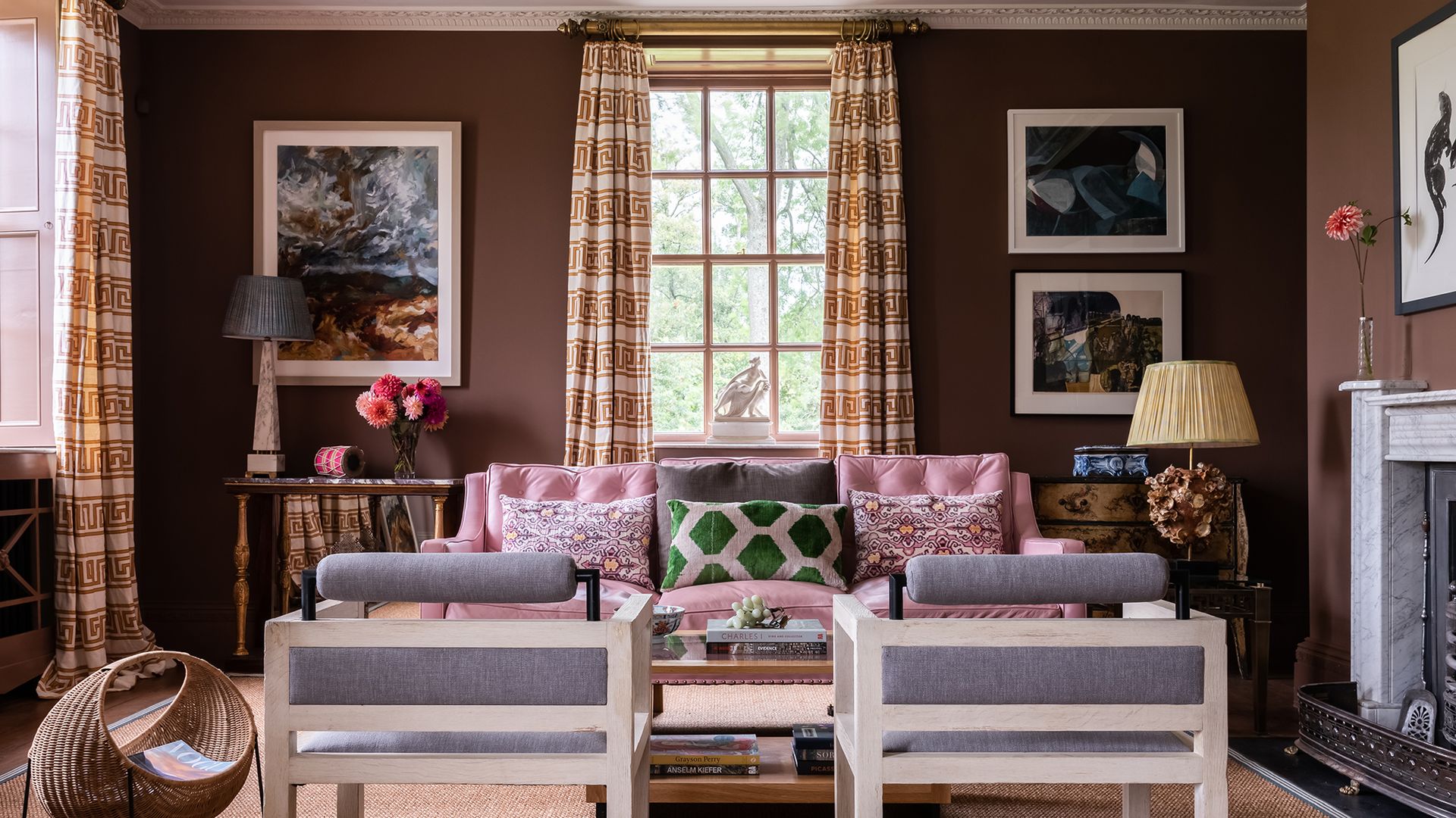
The brown and dark neutrals family might also feel like one that will always work, but there are still possible mistakes to be aware of.
‘This is a heavier color family that tends to do well in blackout situations where the hue’s ability to soak up light is utilized without much effort,’ says Dustin Gerken. ‘Avoid placing this color in a light-filled, stark room where the earthy, tectonic tone will be the heaviest visual in the space. Certain darker neutrals can “turn the corner” well – akin to greens – but that also can be this color’s disadvantage if it’s situated off the wall, allowing the shadows behind the fabric to blend in and obscure the depth of the room.’
4. Blue
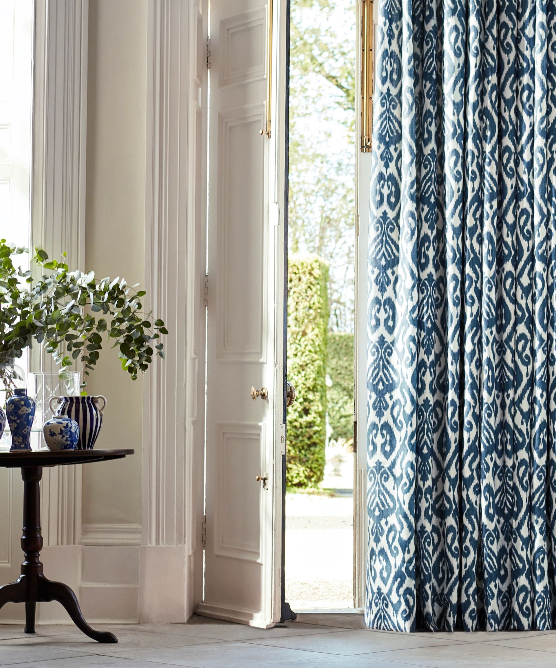
Blue might seem to be a curtain color choice without complications. There’s a but, though. ‘Not all blues are created equal,’ says Artem Kropovinsky. ‘Some blues can appear too cool and sterile, while others can be too bold and overwhelming. When selecting a blue curtain, consider the undertones and saturation, as well as the overall color scheme of the room. A soft, powder blue can bring a sense of calm and serenity to a space, while a deep, inky blue can add drama and sophistication.’
Take the amount of daylight that reaches the room into account, too, to avoid making a mistake with blue. ‘Avoid navies and other dark blue shades in a room that does not get much natural light,’ recommends Carlin van Noppen. ‘They can appear dominating and will make the space seem even darker. If using blue curtains in a dimly lit room, go with a lighter shade (examples: a pale blue, robin’s egg) that coordinates with the trim and decor in the room.’
Consider the landscape outside the room, too, to swerve errors. ‘This color works best on curtain fabrics with less unobstructed sky color that exaggerates the blue from the sky,’ says Dustin Gerken. ‘Dappled light through trees or indirect lighting through the curtains are the safest plays with this color. I would also slide the scale towards the more opaque side of the fabric spectrum, avoiding a more sheer material that only adds to the blue saturation as the sky’s blue is reflected through the fabric.’
5. Green
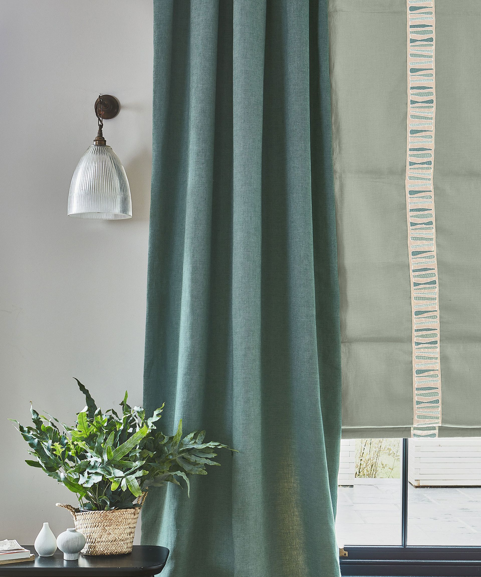
Green can be an appealing shade for curtains but learn lessons from the interior experts if you’re planning on choosing it.
‘When it comes to green, it’s all too easy to fall into the trap of selecting a shade that blends in too much with the surrounding nature,’ says Artem Kropovinsky. ‘Instead, consider using a green curtain as an opportunity to introduce a bold pop of color to the space. A vibrant chartreuse green, for example, can add a playful and energetic touch to a room.’
Don’t choose green without considering the other hues in the room either. ‘If the walls, carpet, and furnishings in a room are all bright, vivid colors, I would advise against solid statement-colored drapes in green,’ says Carlin van Noppen. ‘This mistake can make the room look too busy and poorly planned. If you already have the perfect green curtains in mind, I recommend making these a focal point of the room and planning the rest of the decor around the statement color drapes.’ Note that her advice goes for red curtains and yellow as well, on which more below.
Focus on curtain style or you might miss out on green’s potential, advises Dustin Gerken. ‘This is a great color that does well with pleated and shaped curtains that allow the fabric to “turn the corner”,’ he says. ‘Greens are great when you allow the shadows and light to go from darker forest colors to lighter, yellowish hues. Stay away from simpler, flat-paneled looks with greens because you won’t be taking advantage of arguably this color’s best attribute.’
6. Red
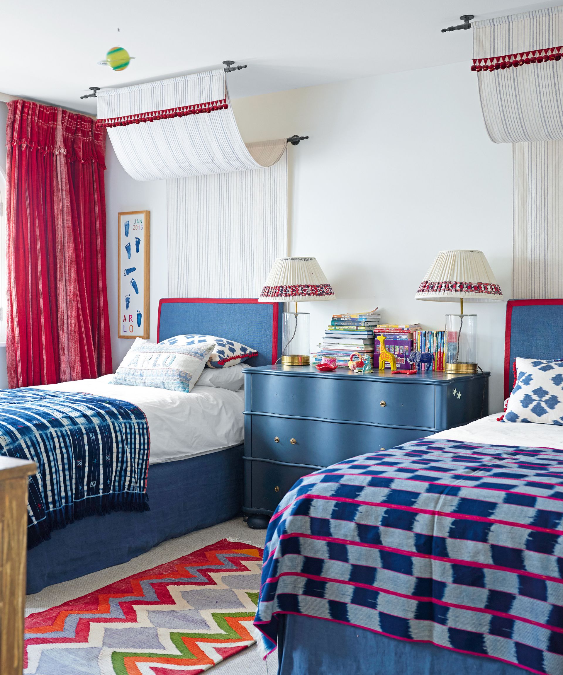
Considering going bold with red curtains? To make them a hit and not a miss, tread carefully, say the experts.
‘You want to avoid using reds when your fabric panel has too much pleating and organized structure dictated through the mounting style,’ explains Dustin Gerken. ‘Repetitious pleating and formality will give a red curtain a Palais Garnier [Paris opera house] look that could be too theatrical if you’re not ready for it. With red hues, stick with a less structured panel.’
Think color proportion within the room, too. ‘Red is a powerful color that can easily steal the show if used too prominently,’ says Artem Kropovinsky. ‘A deep, wine red can add richness and sophistication to a space, while a bright, fire-engine red can bring energy and excitement. When selecting a red curtain, consider the surrounding color scheme and use it as an accent, rather than the main event.’
Blima Ehrehtreu agrees that less can be more in the case of red curtains. ‘I always keep in mind that too much of a bold color can be overpowering and create a too intense vibe,’ she says. ‘To avoid a cluttered look, I look for opportunities to use red curtains as an accent against a neutral or muted background.’
7. Yellow
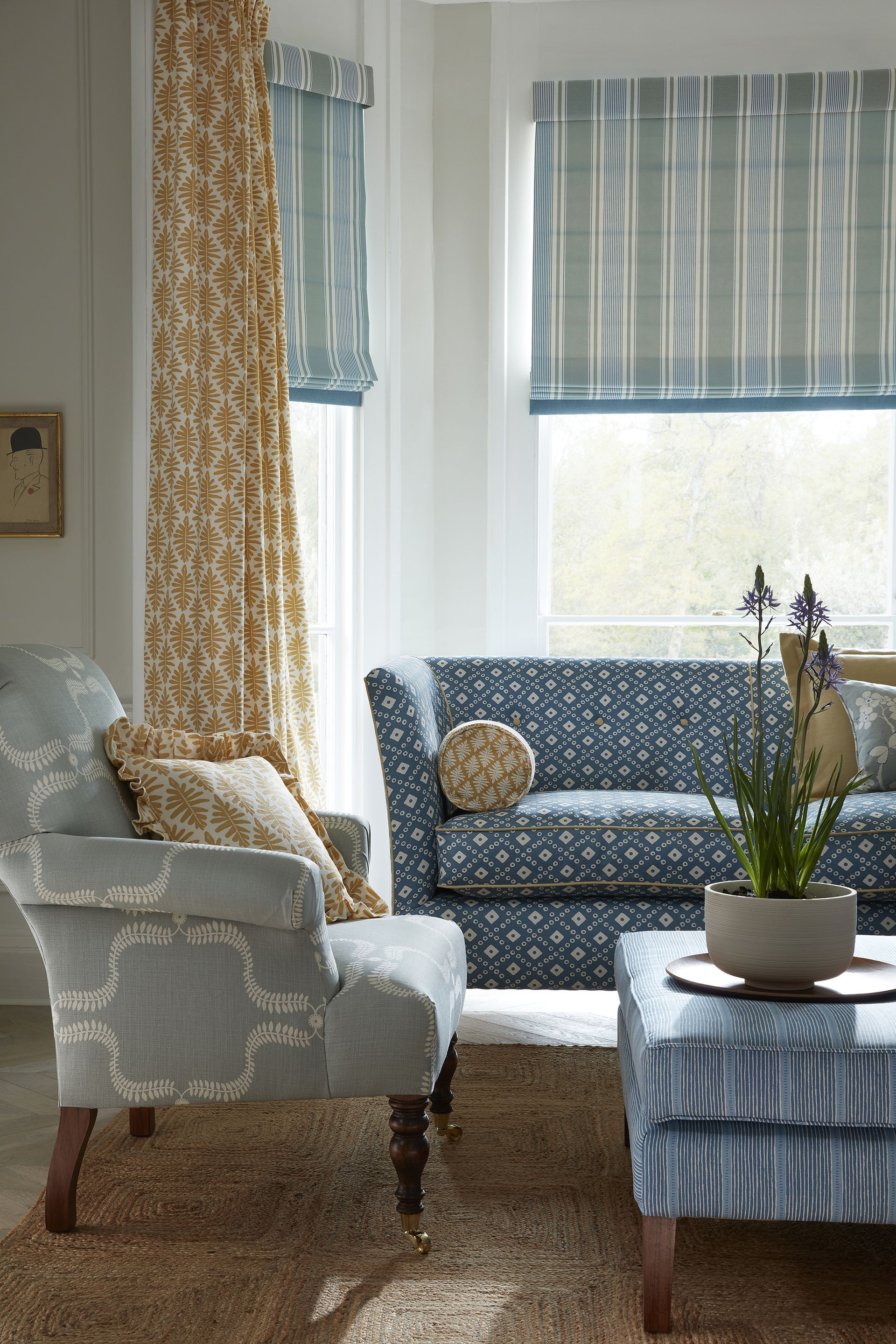
If you’re thinking yellow, as with red, you can get too much of a good thing. ‘Yellow is a tricky color to work with, as it can quickly become overwhelming if not used correctly,’ says Artem Kropovinsky. ‘A soft, buttery yellow can bring warmth and cheer to a space, while a bright, lemon yellow can make a bold statement. When selecting a yellow curtain, consider the undertones and saturation, and use it sparingly for maximum impact.’
It’s also worth bearing in mind the desired atmosphere of the room when considering yellow. ‘Yellow is the color of sunshine and associated with joy, happiness, intellect, and energy,’ says Channa Alvarez, designer at Living Spaces (opens in new tab). ‘It is an excellent choice for kitchens, dining rooms, and bathrooms. In hallways, yellow can feel welcoming. However, studies show that people are more likely to lose their temper in an all-yellow interior, so it should be used sparingly. Dull or dingy yellow represents caution, decay, sickness, and jealousy and is rarely used in interior rooms.’
8. Magenta
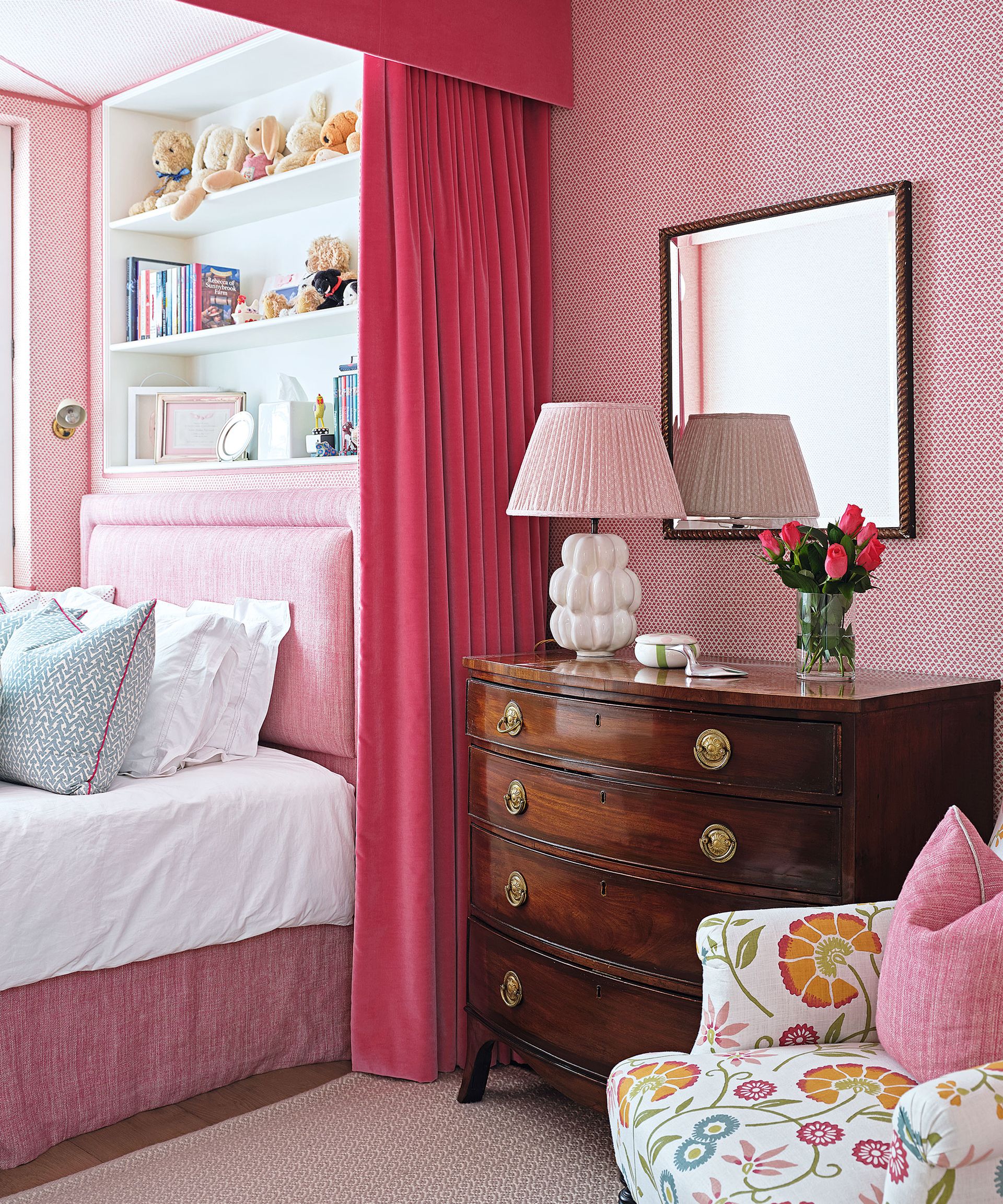
Viva Magenta is Pantone’s color of the year 2023. It ‘vibrates with vim and vigor’, according to the color experts, yet is ‘rooted in nature’. But if you’ve fallen for its energy, be mindful that it is possible to make mistakes if you choose it for curtains.
‘I always consider the intended mood and atmosphere before incorporating it,’ says Blima Ehrehtreu. ‘In smaller rooms, too much of this powerful hue can be overwhelming, creating an overpowering vibe with the drapery. To keep it from dominating the space, I suggest choosing a pattern incorporating magenta and other colors or using it as an accent.’
Which color curtains go with everything?
Neutral curtains in tones such as beige, taupe and gray, as well as white and nearby shades such as ivory and cream can be the go-with-everything choice. ‘When it comes to choosing window treatments more often than not we tend to opt for white or neutral fabrics for a timeless, classic look,’ says interior designer Angela Hamwey, founder and creative director of Mackenzie & Co (opens in new tab).‘We elevate our window coverings with a light-quality lining for a luxurious feel.’
However, there are still mistakes you can make when choosing these curtain colors. Match them too closely to the walls and the overall effect can be disappointing. To avoid this, consider versions with extra decorative detail such as an accent of color, or focus on the curtain rod. ‘If you’re looking to add a bit more interest, you could always try contrasting hardware such as bold black or antique brass,’ says Angela.
Should all curtains be the same color?
The curtains in your home don’t have to be the same color. For each room, think about the best curtain option for the space. ‘It’s essential to choose a color that enhances the room, rather than detracting from it,’ says Artem Kropovinsky, founder and principal at New York-based interior design studio Arsight (opens in new tab).
‘Take the time to consider the lighting, architecture, and overall design scheme before making a decision, and don’t be afraid to experiment with bold hues and patterns for a truly captivating space.’

Sarah is a freelance journalist and editor. Previously executive editor of Ideal Home, she’s specialized in interiors, property and gardens for over 20 years, and covers interior design, house design, gardens, and cleaning and organizing a home for H&G. She’s written for websites, including Houzz, Channel 4’s flagship website, 4Homes, and Future’s T3; national newspapers, including The Guardian; and magazines including Future’s Country Homes & Interiors, Homebuilding & Renovating, Period Living, and Style at Home, as well as House Beautiful, Good Homes, Grand Designs, Homes & Antiques, LandLove and The English Home among others. It’s no big surprise that she likes to put what she writes about into practice, and is a serial house renovator.
-
-
 7 expert-approved methods to remove candle wax from carpet
Cleaning professionals share their tips on how to remove candle wax from carpet
By Millie Hurst • Published
-
 Are you making these critical design mistakes in your small home office? Experts reveal 7 they always avoid
Want to know what's wrong with your workspace? Experts reveal the top 7 design mistakes we're making in our small spaces
By Zara Stacey • Published

